
COMPANY
We manufacture key components that lead the future automobile industry.
CI
Explanation of the logo
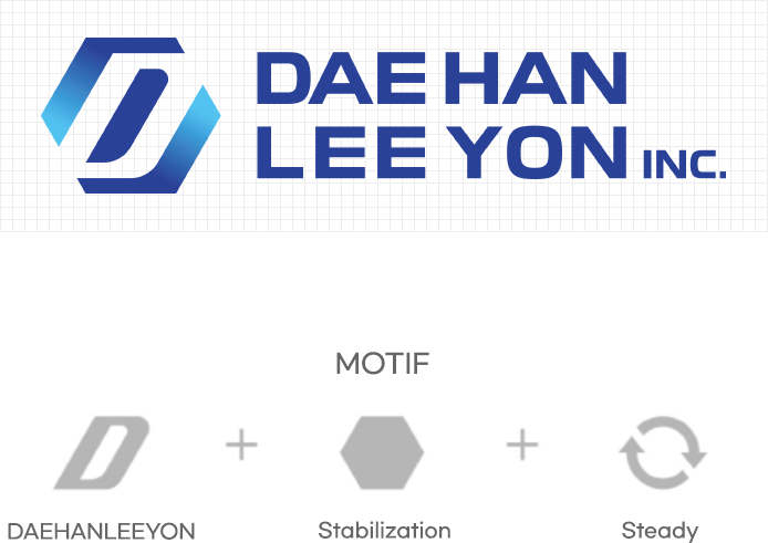
The logo for Dae Han Lee Yon Inc. is a combination of the main initial, D and a hexagon that stands for stability. With a blue gradient colored point in symmetry, it stands for circulation and sustainability.
The two keywords underlie the symbolism of Dae Han Lee Yon Inc. that produces reliable products in a steady manner. Use of Sans-serif font creates a sense of sophisticated atmosphere with dignity.
Logo type
Korean text

English text

Dae Han Lee Yon Inc
Business registration number 306-81-07424
CEO Lee Taek Sung
Main office and plant no. 2
90, Sintanjin-ro 756 beonan-gil, Daedeok-gu, Daejeon (Sintanjin-dong)
Plant 1
24, Pyeongchon 2-gil, Daedeok-gu, Daejeon(Pyeongchon-dong)
Tel. 0429320731
Fax. 042-931-2366
Email. dhly@daehanly.com
